Lifescape
By Janet Armstrong, Accredited Interior Designer, CAPS Certified
Over the last few challenging years we have sought calm, comfortable, familiar colours that supported and furthered our feelings of well-being. In 2023 we have a greater sense of optimism and energy, along with a desire for an infusion of hues that are lively, energetic and playful.
Paint companies spend a great deal of time analyzing shifts in sociological, economic and environmental issues and challenges; they also consider the political climate, technology and scientific factors in order to determine what colours will emerge as trends.
The results are colours of the year that provide endless inspiration for a refresh and update to the various spaces in your home. So what colours are we going to see and where and how can you use them?
From Benjamin Moore, Raspberry Blush (2008-30) brings “vivacious optimism, undeniable charisma.” The coral red has undertones of pink and works well with a variety of whites for a crisp contrast. Other colours in the palette include bold and earthy tones that are both upbeat and dynamic.
Sherwin-Williams has selected Redend (SW 9081), a warm shade of red with earthy undertones. The accompanying palette includes a collection reminiscent of the natural world around us, providing a sense of wellness and endless possibilities for updates to your interior.
Farrow and Ball’s spirited and fiery colour for 2023, Bamboozle (No. 304), adds joy and warmth wherever it is used. Whether your style is traditional, contemporary or modern, Bamboozle provides a beautiful backdrop and works well in many decor styles. Its versatility means it pairs well with a variety of other colours from warm to cool and light to dark.
Late in 2022 Pantone announced Viva Magenta as its colour for 2023. A strong energetic red-pink, Viva Magenta is definitely not shy and adds a punch wherever it is used. As Pantone has noted, it’s “an unconventional colour for an unconventional time.”
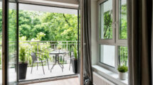
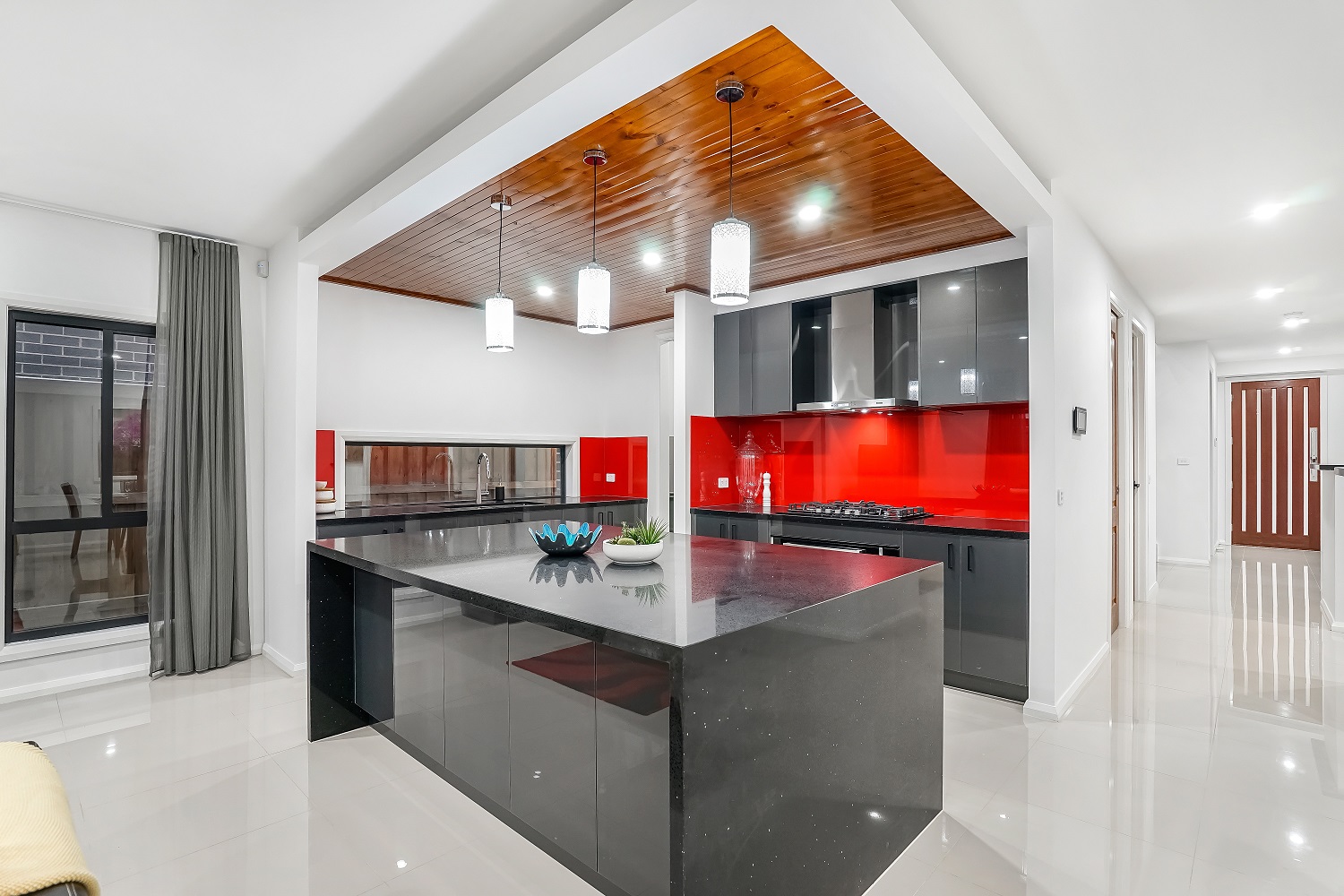
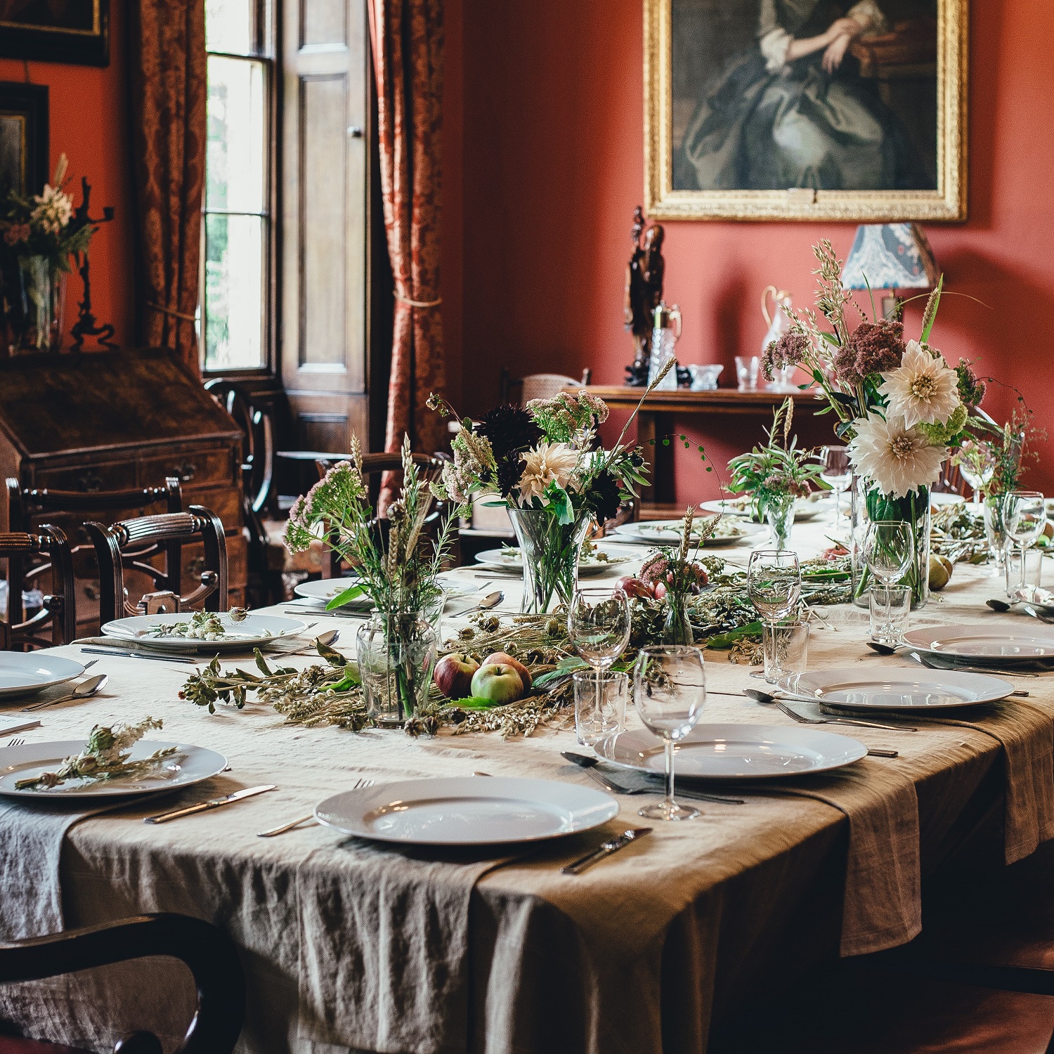
So where can you use a shade of red? It is a beautiful colour for dining rooms, making guests feel welcome, comfortable and invigorated. Versatile red works well in kitchens too, either as a wall colour, for cabinets or in a backsplash. A feature wall painted in red would be a beautiful focal point in an entranceway or a family room.
Passionate, courageous and driven, reds are not for everyone, but even a touch of the colour brings energy and vitality to a room and signals a shift in our collective psyche. Consider adding throw cushions in a shade of red that coordinates with your existing colour palette. Try painting the back of a bookcase in red to provide a focal point and a dramatic backdrop for your books and objet d’art. Or add a piece of artwork with shades of red. Red vases on an occasional table or mantel also add punch, while a beautiful bouquet of red flowers adds colour while also lifting your spirits.
Charismatic, upbeat red is going to be seen everywhere over the next year or two and it signals our desire to re-energize our homes. Whether pairing red with lighter neutrals for a crisp look or with darker colours for a more dramatic ambience, options are limited only by your imagination. How are you going to incorporate red in your spaces? Enjoy dreaming and planning as you move forward with spirit and optimism.
Janet Armstrong (www.simplyswankdecor.ca) is a graduate of the Interior Design Institute of Canada, CAPS (Certified Aging in Place Specialist) and chair of the Decorators and Designers Association of Canada (DDA Canada).