Lifescape
By Janet Armstrong, Accredited Interior Designer, CAPS
Over the past several months, various paint companies have announced their colour of the year (COTY) for 2024. They’ve included a supporting cast of colours that complement the COTY so you can develop a palette that will work regardless of your style and the space you would like to refresh. I always happily share this news with my other half, who is my “colour consultant.” This has been a longstanding joke because is he is actually partially colour-blind, particularly in the green spectrum. It’s an issue that will not improve with time, since our eyes begin to perceive colour differently as we age.
This is attributed to a number of factors: The retina receives less light as we age, due to reduced pupil size and thickening of the lens; the lens is increasingly less clear, so colours appear less vivid; and the lens begins to yellow, so we lose sensitivity to short wavelengths of light, such as blue light. The result is that colours appear less vibrant, contrast is less noticeable, pale colours appear white and shades of blue, green and purple appear grey. There are other challenges with vision as we age: Our eyes don’t adjust from light to dark as quickly; we are more sensitive to glare from sunlight and unshaded light bulbs; and we experience less depth perception, making it challenging to judge distances. It is important to understand these age-related vision changes as you consider colour choices for updates to your spaces.
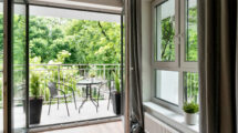
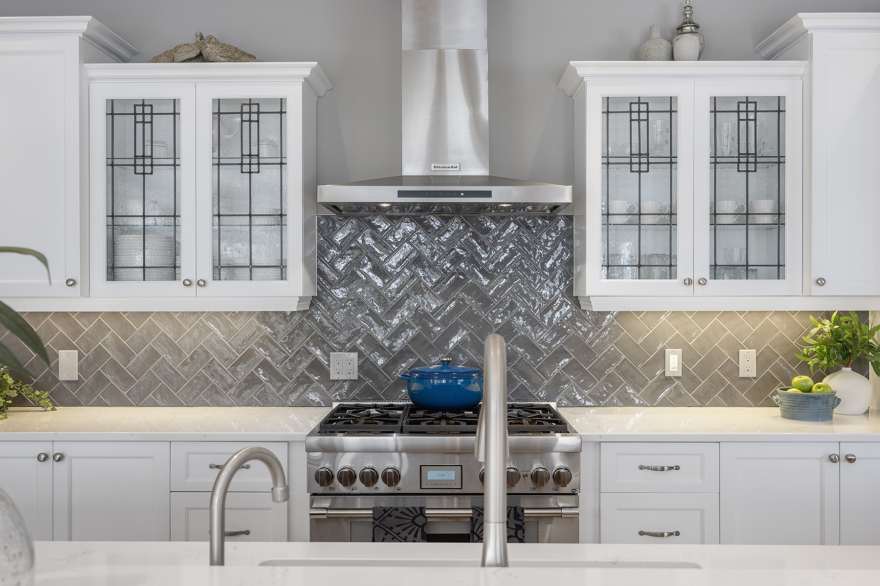
In recent years, we have seen a trend toward predominantly white kitchens. While this aesthetic is striking in its simplicity, for aging eyes it can present a safety issue. The combination of light counters with light backsplash does not provide sufficient contrast to gauge depth, increasing the risk of not placing items in a safe position on the counter. This could result in dropping things or not being able to gauge the distance to a knife or pot of boiling water. A clear distinction in colour between the counter and backsplash will ease this challenge and enhance your safety. For example, if you have lighter-coloured counters, consider a darker gray or navy backsplash. Conversely, if you have a dark counter, install a lighter-coloured backsplash. Further enhance the contrast by using tile that has some texture to it and consider installing it in a pattern such as herringbone to further augment the contrast.
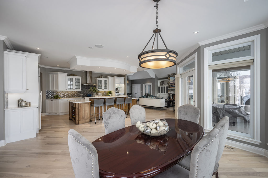
With respect to flooring, it is equally important to ensure there is contrast between floor and wall colours to support navigation and prevent collisions or falls. In fact, consistent, transition-free flooring throughout a home not only improves safety and eliminates a tripping hazard, it also reduces fear and confusion for those with cognitive challenges.
Hardwood flooring and luxury vinyl tile (LVT) are ideal options as they are easy maintenance, come in a variety of colours and support easy movement, particularly for those using a mobility aid such as a cane, walker or wheelchair. A combination of darker floors and lighter walls is ideal to enhance safety.
In addition to opting for contrast and consistency in your choice of flooring and colour, lighting is an important safety consideration. Because older eyes don’t adjust as quickly to changing light levels (light to dark and dark to light) or shift as easily from perceiving things at close range to those at a distance (and vice versa), the lighting in our homes needs to be changed as we age.
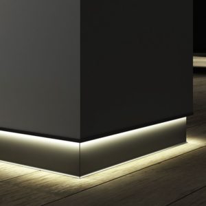
LED bulbs are recommended as they emit more light per watt than other types of bulbs, last longer and are more durable. Using LEDs for task and ambient lighting will instantly brighten your rooms, making it easier to see clearly. Improved lighting of hallways and stairs is also necessary to ensure you can clearly see to navigate these transition spaces. In addition to LED bulbs in ceiling fixtures, the installation of lighting along baseboards in hallways will ensure the entire area is well lit to maximize visibility and guide you as you move through the space.
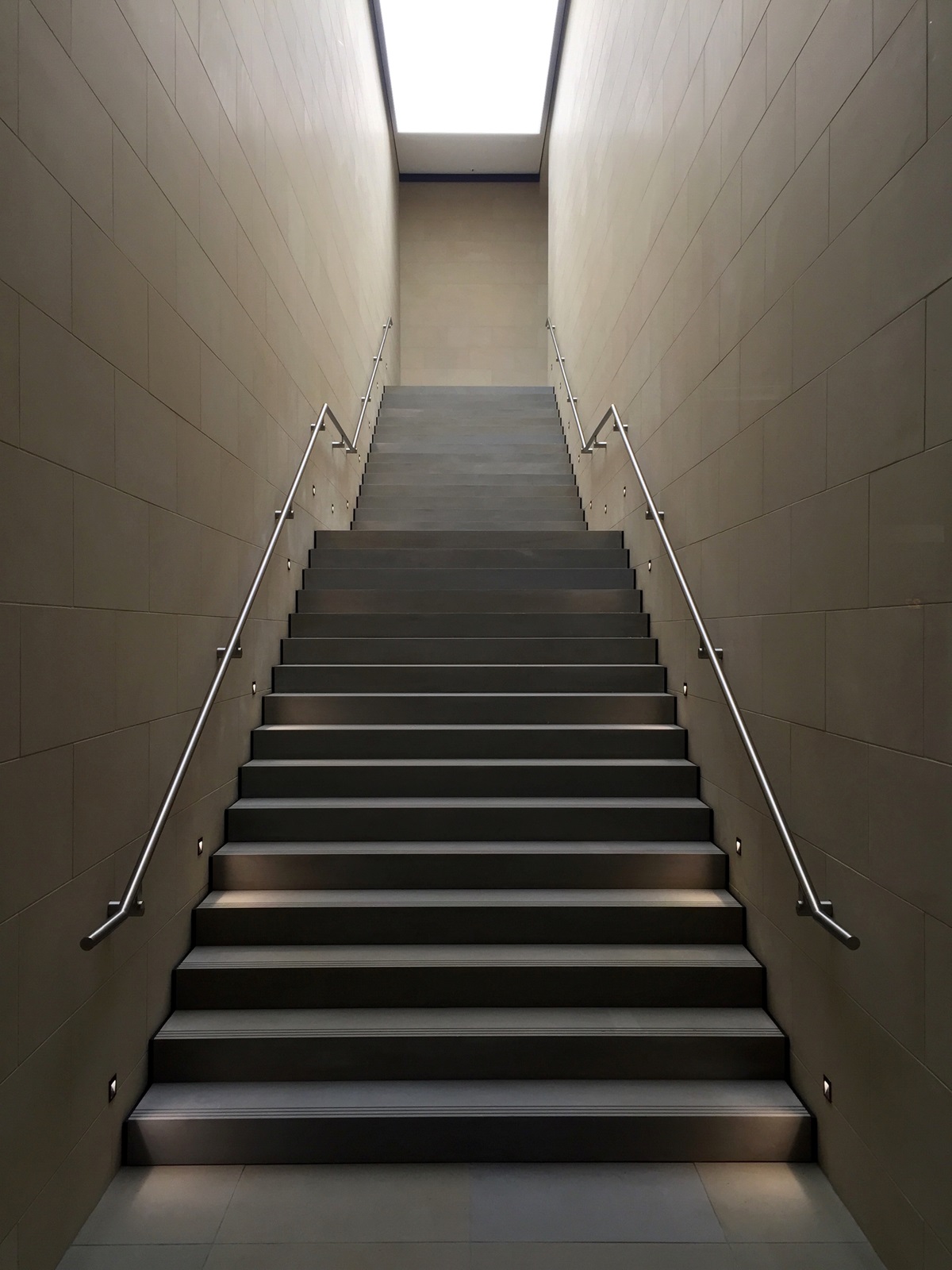
Improved stairway lighting is a necessity as our changing depth perception can increase the risk of a fall. There are a number of options available for stair lighting, including strip lighting beneath each tread, recessed lights on the sides of each stair or one or two recessed lights on each riser. Any one of these options ensures each stair is clearly lit, increasing the safety of navigating the steps whether you’re going up or down. For even more visibility, consider a strip of lighting installed under the length of the handrail.
If you are planning updates to your home in the coming year, consider areas that may need to be modified to improve safety for you and your guests. Thanks to the variety of colours, materials and lighting options on the market, it is possible to make selections that not only allow you to stay safely and comfortably in your home, but also to express your personal taste and keep your home looking stylish.
Janet Armstrong (www.simplyswankdecor.ca) is a graduate of the Interior Design Institute of Canada, CAPS (Certified Aging in Place Specialist) and past chair of the Decorators and Designers Association of Canada (DDA Canada).